Work
I am passionate about writing clean, reusable code to craft web experiences that work well for users. I love writing reusable code for all aspects of front-end development, whether it's reusable components for React or Angular, mixins and CSS frameworks written in SASS, or partials and includes for static-site generators like Jekyll. So regardless of what project I'm working on, I always look for a way to modularize my code so I can make my work easier to maintain and share efficiencies with my team.
View resuméOverstock
- React
- Redux
- Server-side Rendering
- Jest
- Enzyme
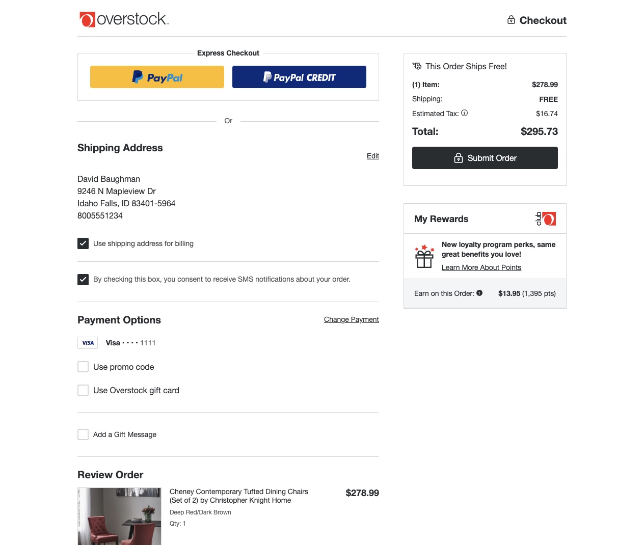
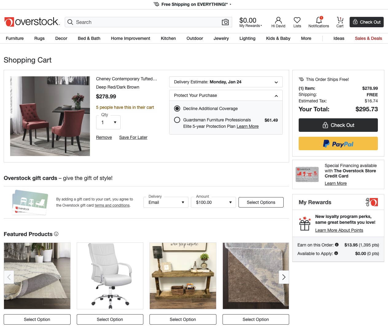
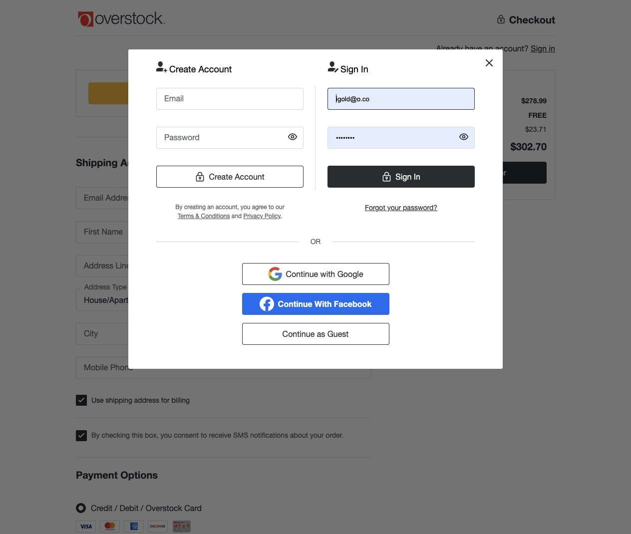
One of my proudest accomplishments was replacing 7 different implementations of the login page with a single modern login application built with Preact. Centralizing and modernizing this application has made it possible to quickly iterate on improvments to the login experience, including the addition of social login and A/B testing placement of the secondary login buttons.
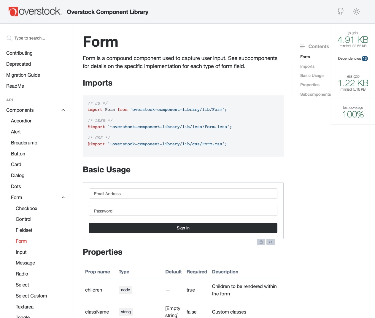
In addition to supporting my core team, I also volunteered to help build and maintain the internal React component library that is used by the front-end teams across the company. The library was in a neglected state when I joined. After identifying a variety of problems with lack of consistency and the need for standardization, I helped implement patterns and processes that have helped get the library into a much better state and ensure its longevity long-term. Some examples of improvements we made to the library include introducing compound components, improving component test coverage to 100%, and implementing standardized documentation.
Melaleuca
- NodeJS
- AngularJS
- Elasticsearch
- AWS Lambda
- SASS
- Gulp
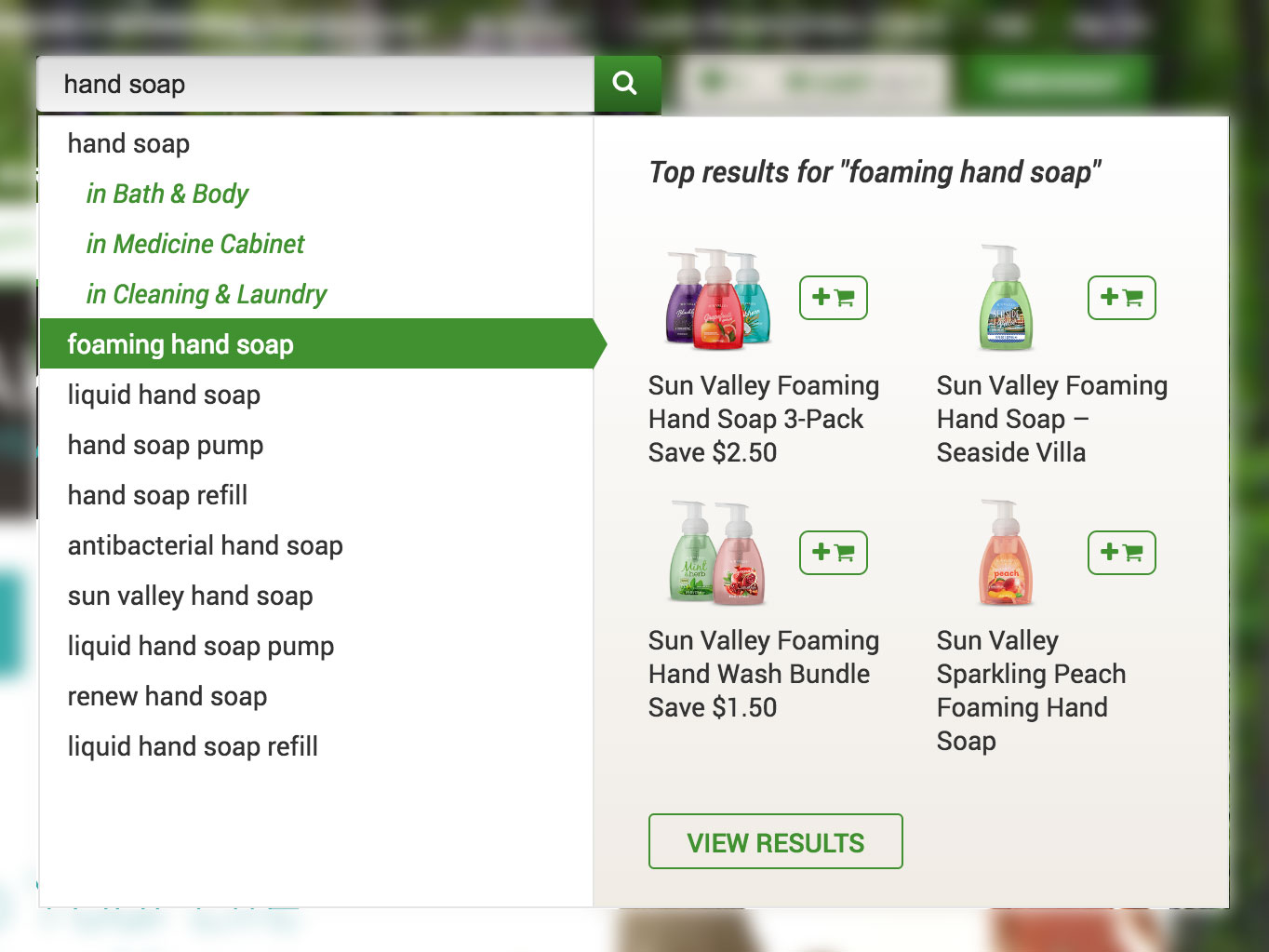
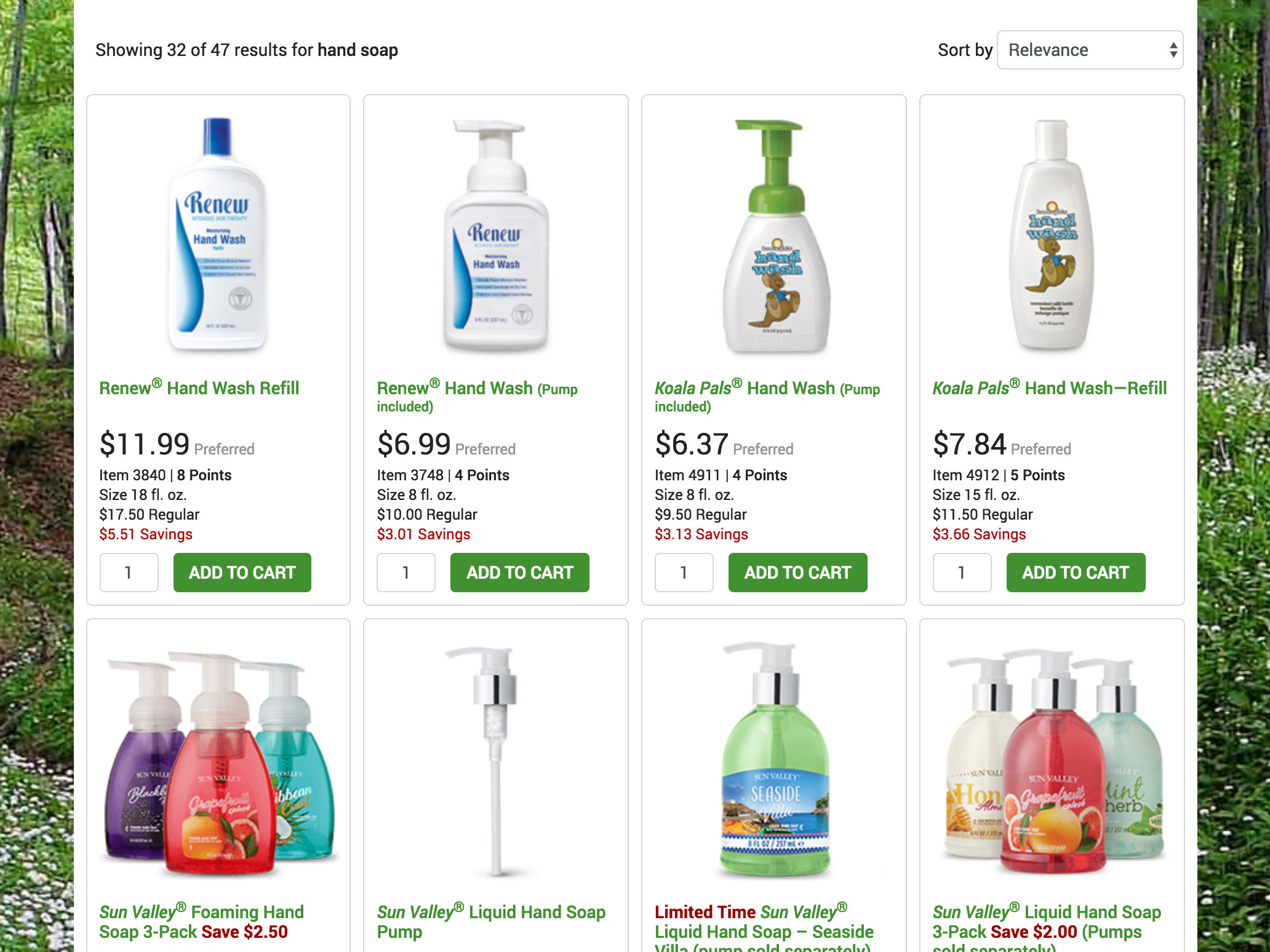
The main project I’ve worked on at Melaleuca is replacing their eCommerce search engine with Elasticsearch running on AWS. I was responsible for setting up the search engine itself, the data stream from a NoSQL database, the REST API and the front-end application that ran on melaleuca.com. The setup scripts for Elasticsearch and other AWS services were all written in NodeJS, heavily utilizing the AWS JavaScript SDK and other Node packages. I created resourceful solutions to problems like accurate query suggestions and product relevance ranking using analytics data. I leveraged the scripting capabilities of Elasticsearch to simplify client requests and standardize search requests across various applications.
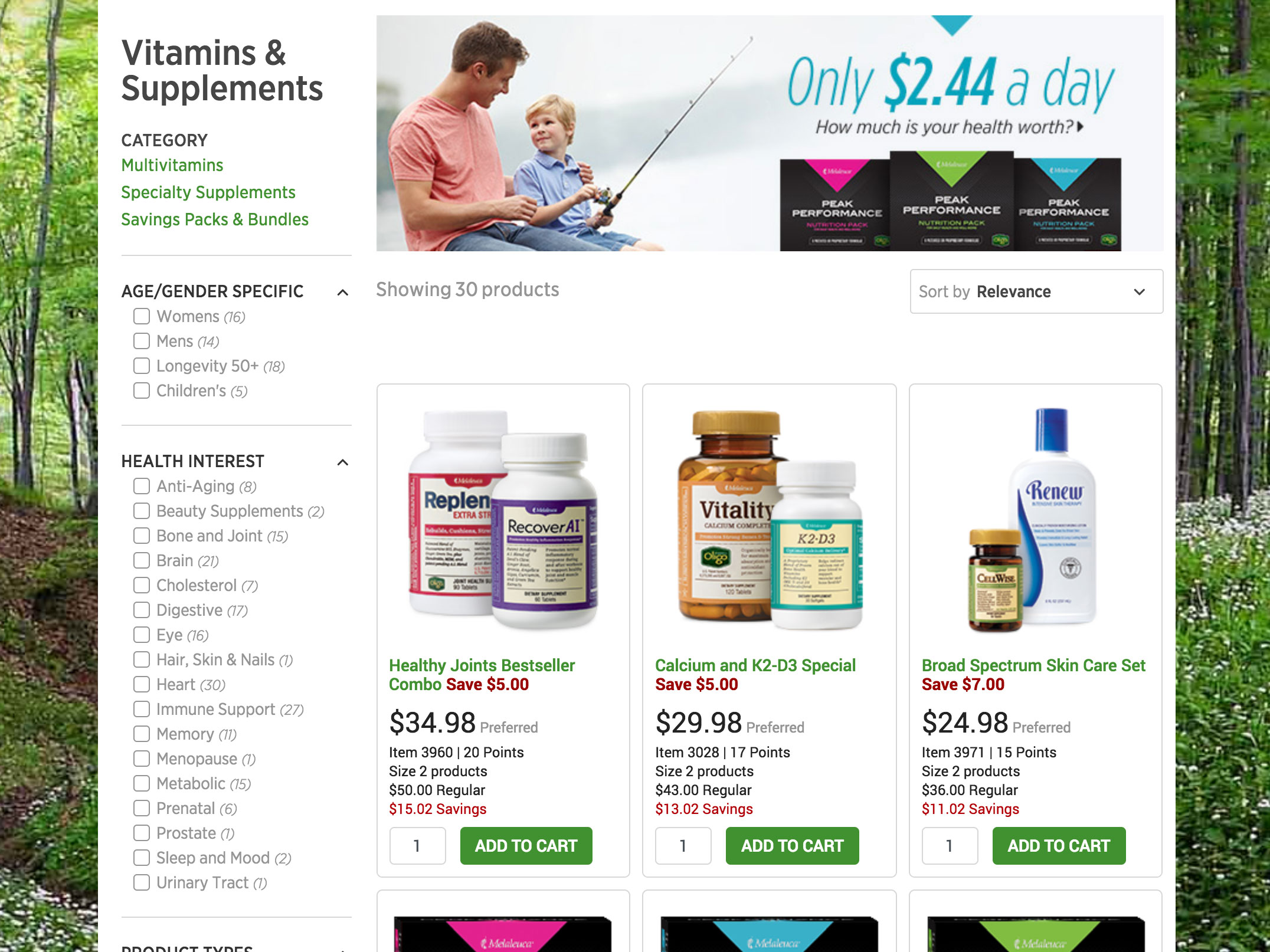
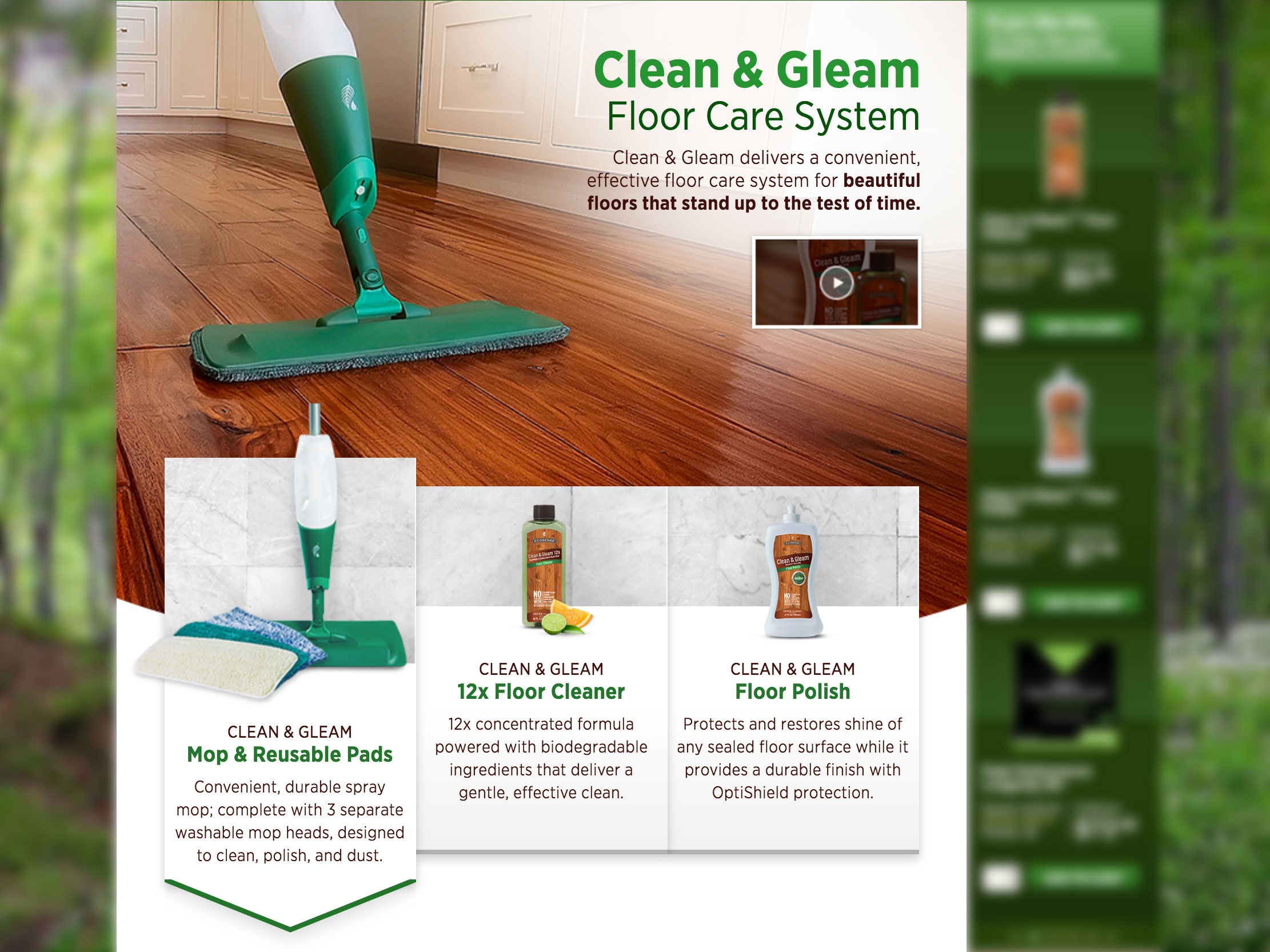
On the front-end side, I made significant improvements over the prior product search experience by converting the search bar and results page to a single-page application, creating reusable components to standardize how product information is displayed, and introducing a localization pattern to minimize code maintenance. I also identified key applications (e.g. product category page) where the search engine could be used to convert those pages to single-page applications.
IMS Health
- Bootstrap
- SASS
- NPM
- Gulp
- Jekyll
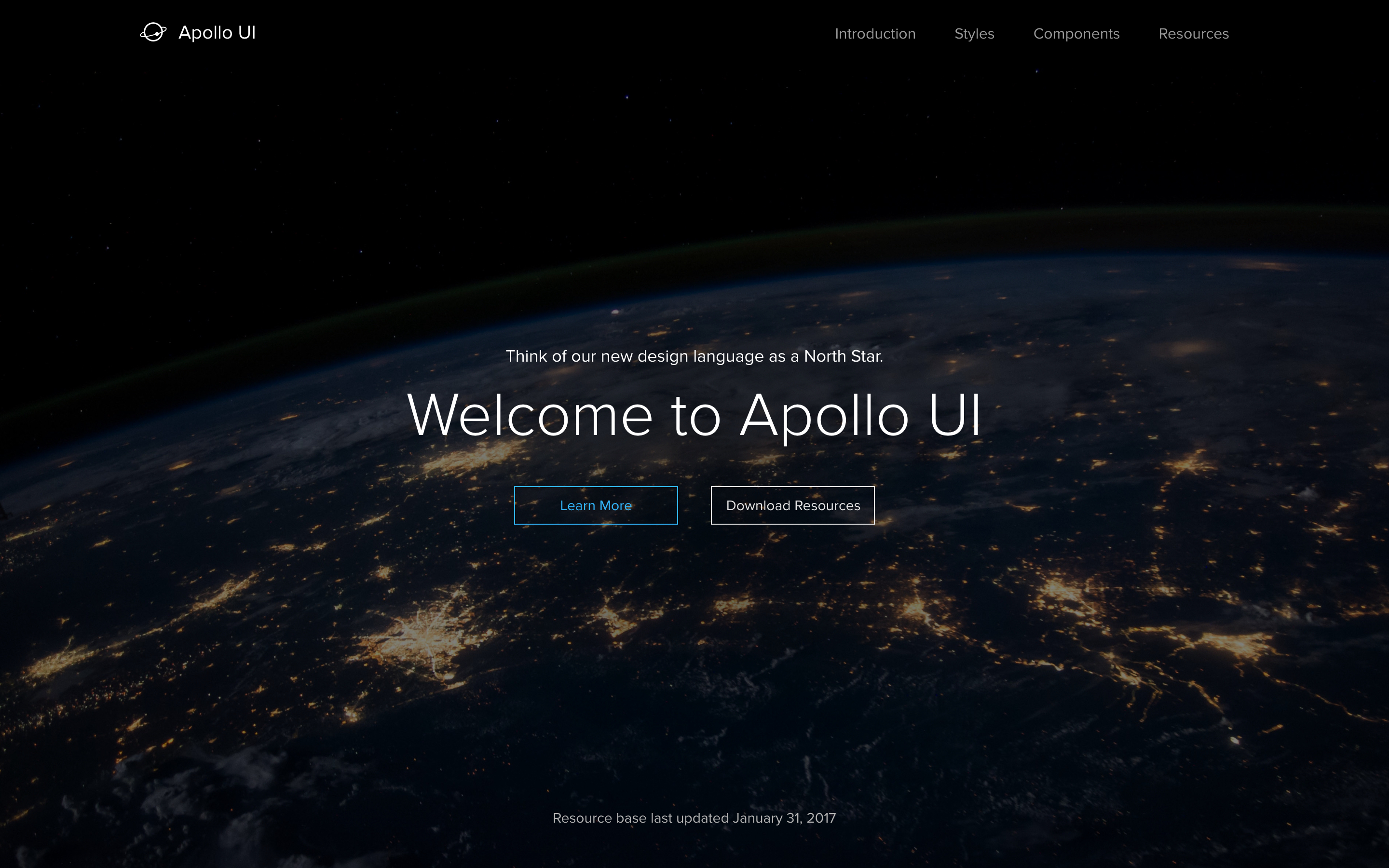
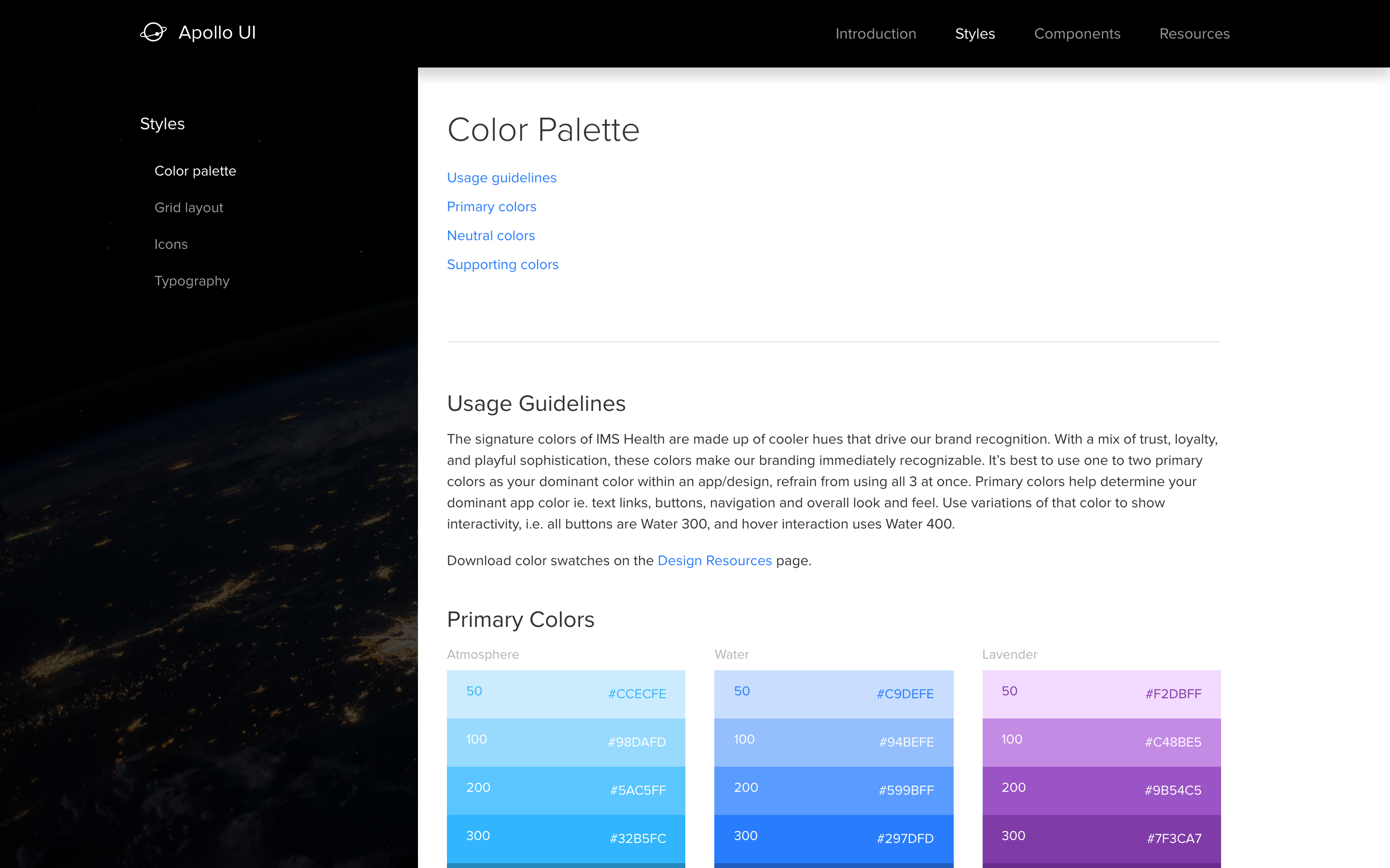
My primary role at IMS Health is to build a CSS framework that implements the company-branded components and patterns. I relied heavily on the markup and naming conventions from Bootstrap, but only used a few parts from Bootstrap itself (e.g. variables, grid, utilities). I created a custom documentation site as part of the project using Jekyll, which includes several layouts for different content types.
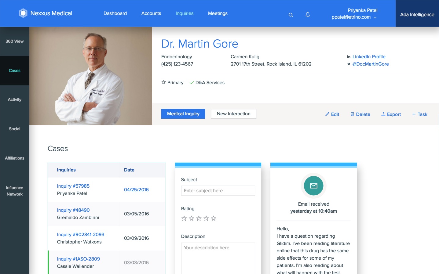
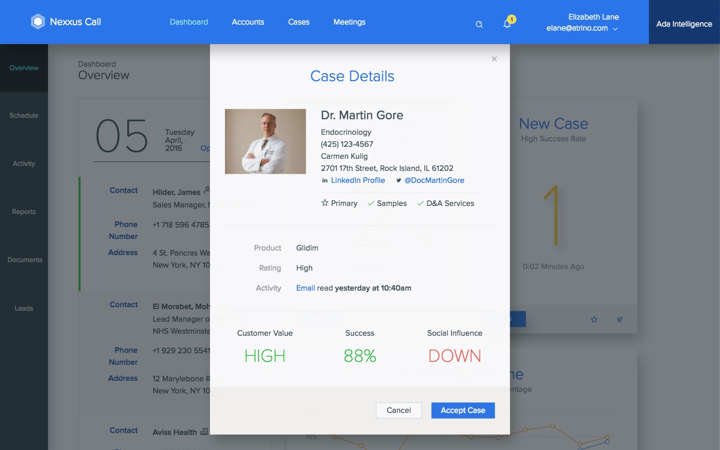
These are screenshots from the documentation site I made for Apollo UI, as well as a prototype I helped build as a demo of how the framework can be used. The prototype was used for a demo at a company conference and was very well received.
Capital One Investing
View website (archived view)
- Bootstrap
- SASS
- NPM
- Gulp
- Jekyll
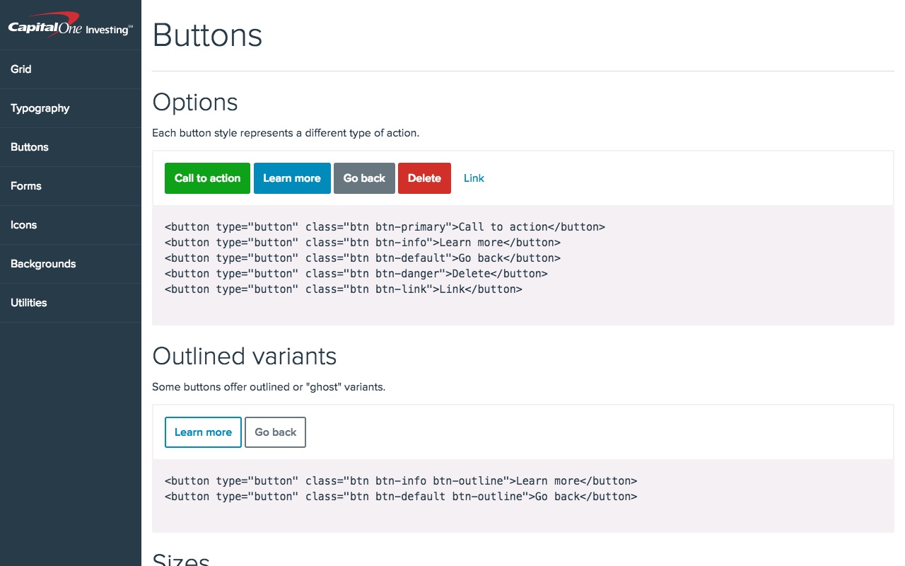
When I arrived at Capital One Investing, they didn’t have a CSS framework to use across their web properties and the result was a lot of design inconsistency from one place to the next. So I applied the knowledge and experience I had gained by working on the CSS framework at REI, I immediately began building a CSS framework that incorporated the master brand elements into a comprehensive set of styles that other developers could use. I used this framework on my projects for the marketing team, and shared it with designers and developers to promote the idea of sharing a core style framework across organizations.
I built the framework on top of Bootstrap and added a simple documentation site for developers to use for quick reference. I also added NPM support so other teams could use the framework as a dependency in their existing front-end build processes.
REI
- Bootstrap
- LESS
- Gulp
- CommonJS
- Nunjucks
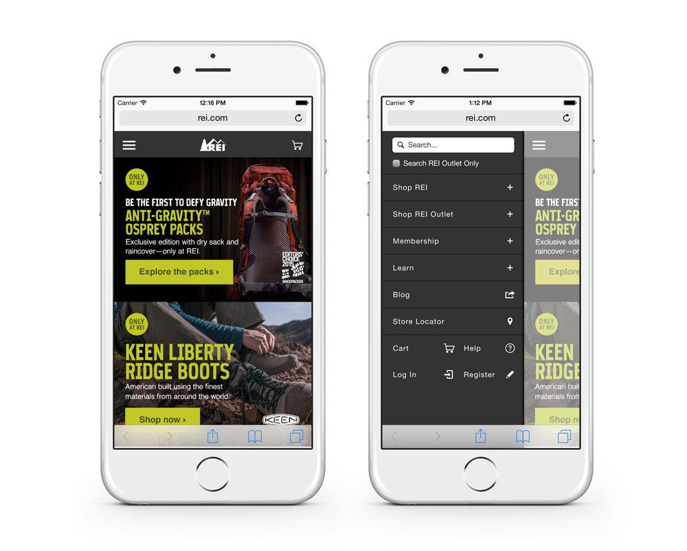
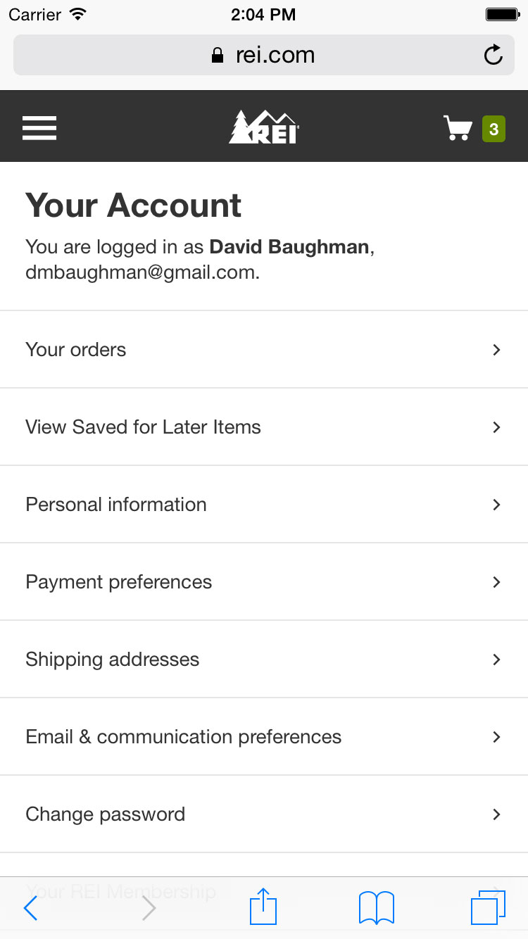
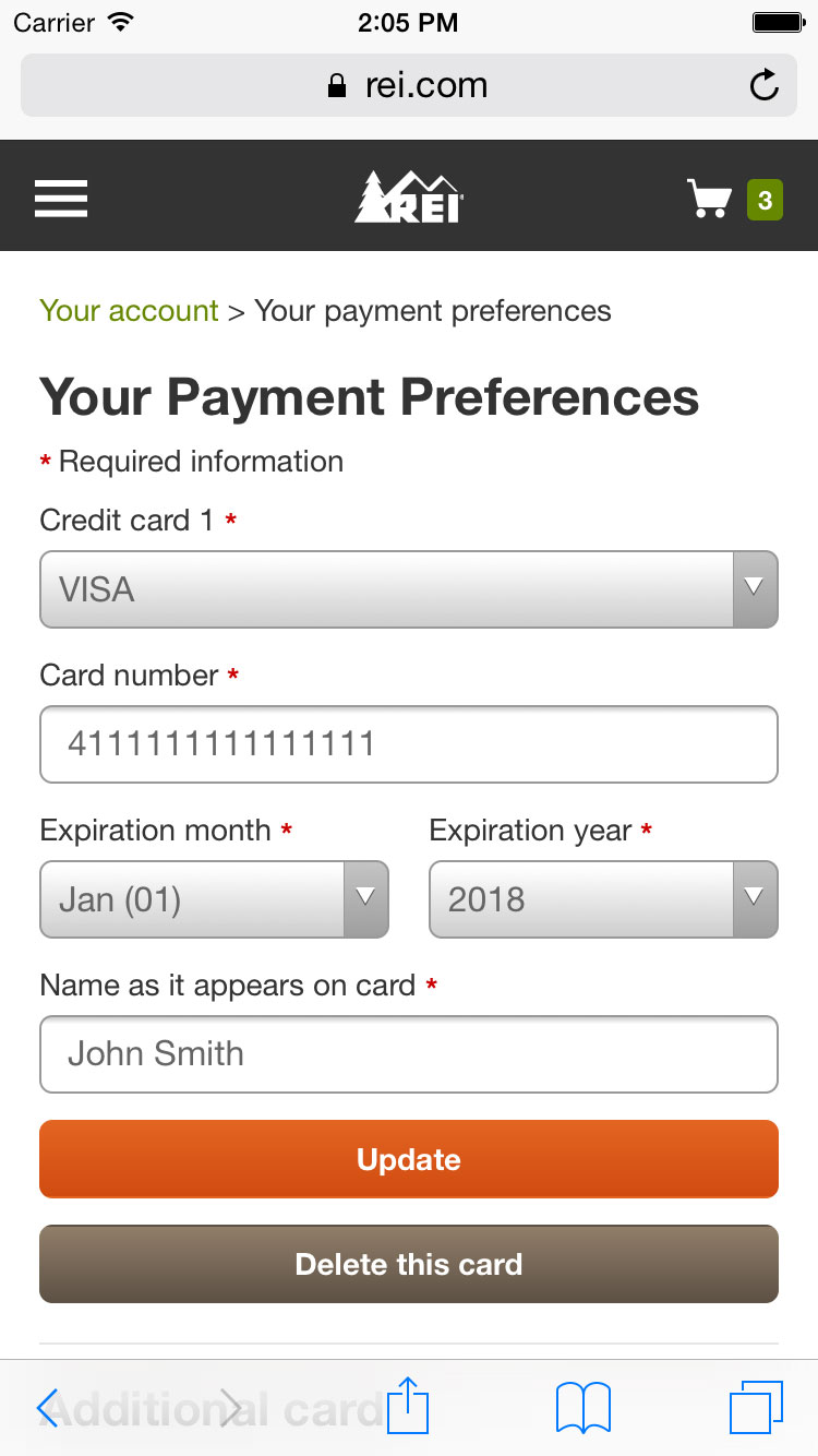
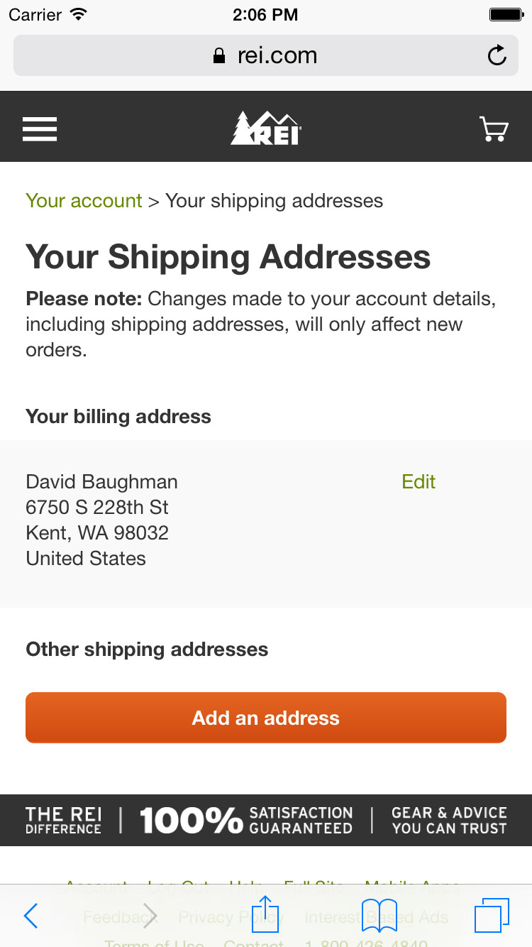
During my time at REI, I built several customer-facing features and pages, including the mobile navigation menu, the mobile user account pages, and the outdoor school search results page. I arrived at REI just before they began to work on a new in-house mobile website and so I was part of that exciting project to create the new mobile experience for rei.com customers.
As I worked on the mobile site, I quickly realized that there was a need for an icon set to use across the site. So I worked with designers to create and implement an icon font that provided a tool for both designers and developers to use. I added this icon font to the fledgling UI framework that was built to support the mobile website project, and I later joined the team that maintains both the codebase and documentation for that framework. As REI is working on doing a complete site redesign, I’m leading the development for the new UI framework and its accompanying documentation.
Softcard
View website (archived view)
- Hyde
- Jinja
- Bootstrap
- LESS
- Grunt
- Handlebars
- jQuery
- AJAX
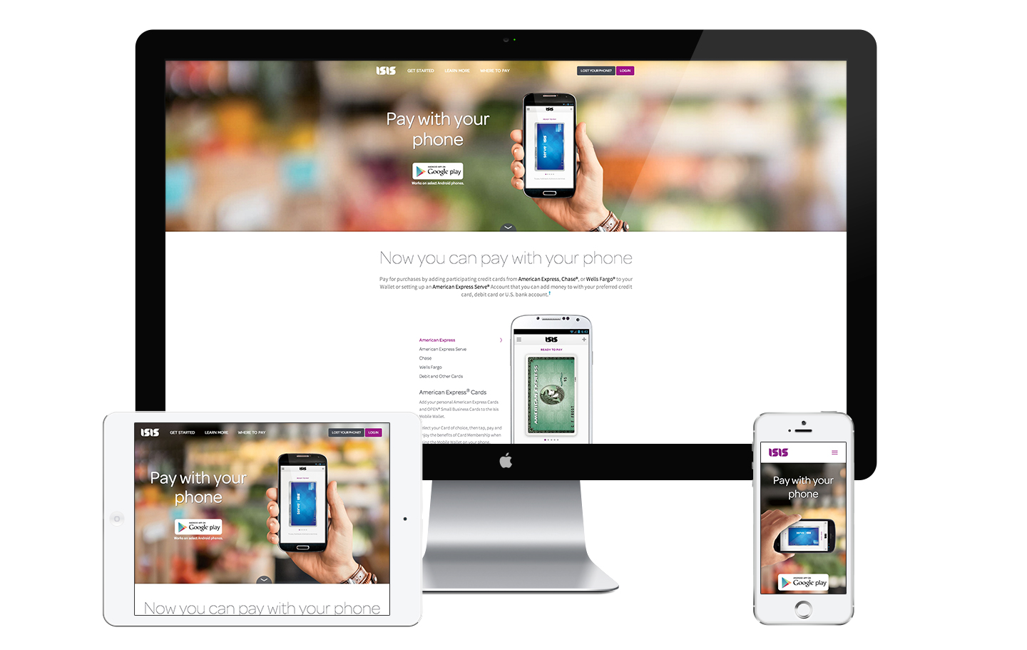
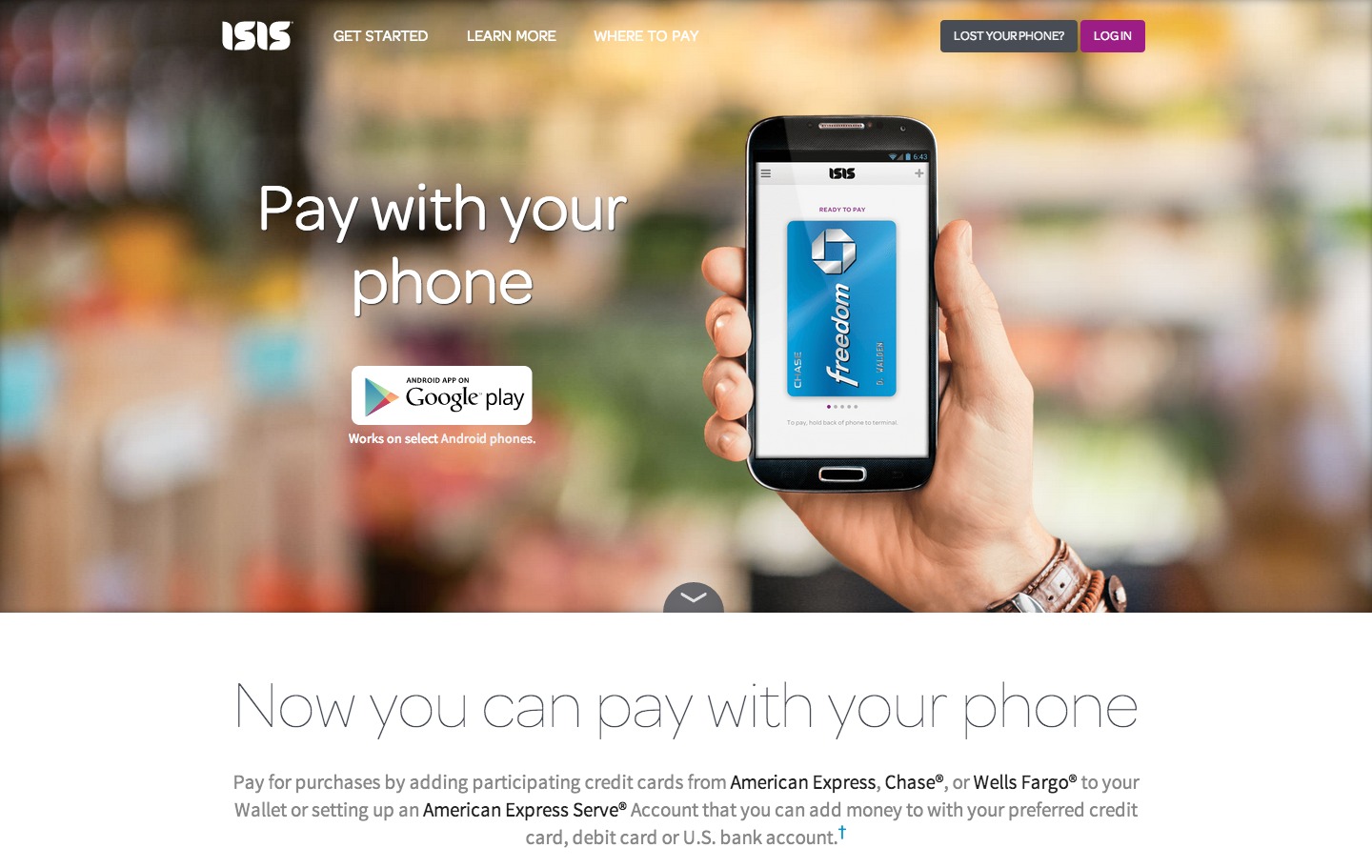
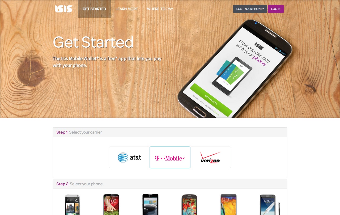
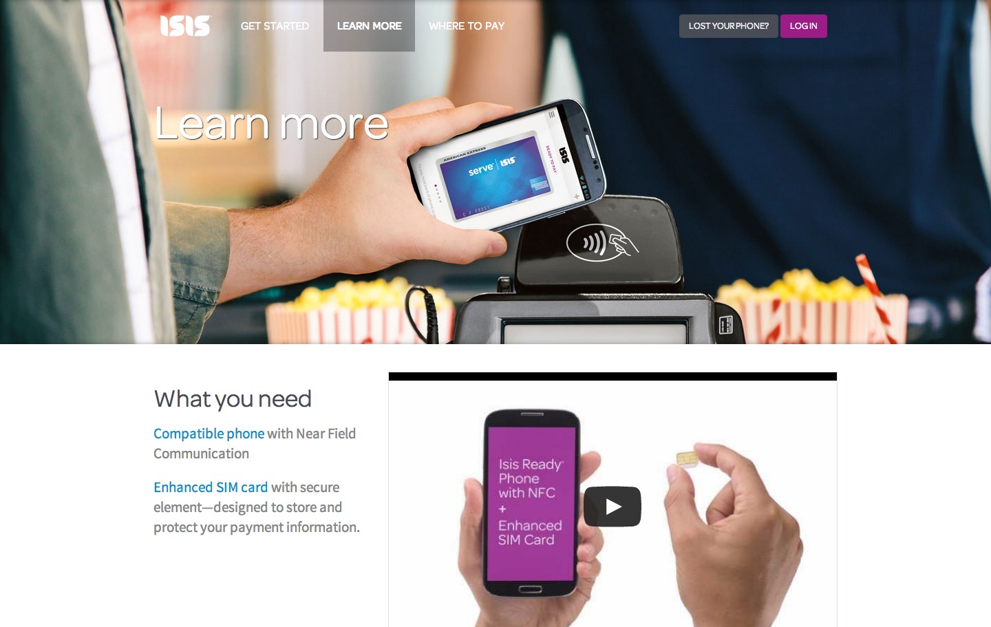
This is the consumer-facing website I built while at Softcard (formerly Isis). Its main function is to introduce the product (a mobile wallet) and help users know how to get started with the app (which has quite a few prerequisite requirements).
I built my local dev environment using Hyde (a Python static site generator) and the UI framework is built on Bootstrap 3. I also began using Grunt to manage my build process, which greatly simplified the day-to-day development tasks of compiling assets and building the site.
Search 3.3
View website (archived view)
- HTML5
- CSS3
- jQuery
- Responsive
- ASP.NET
- SharePoint
- XSLT
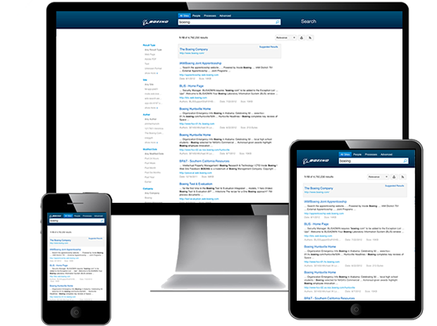
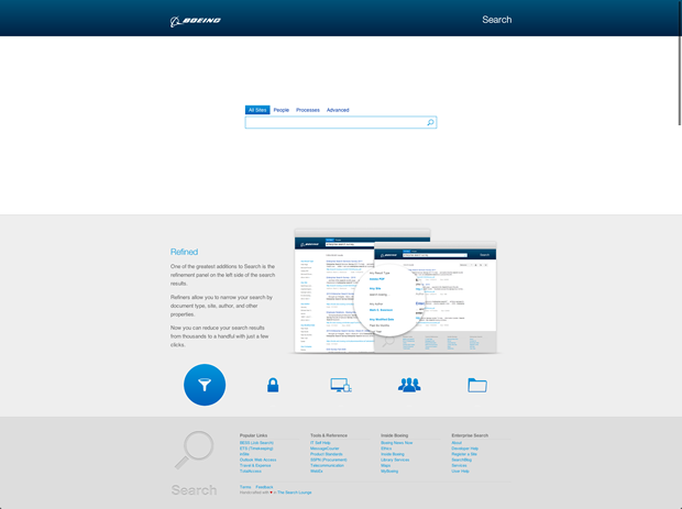
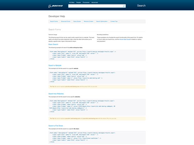
Search 3.3 improved on the visual design of Search 3.1. Instead of using the homepage almost exclusively as marketing space, I decided to put whitespace around the search box so that functionality retained its precedence on the site.
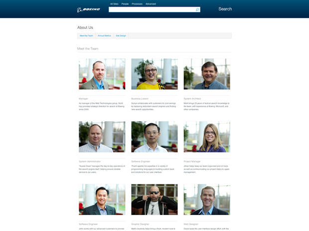
The reference materials on the previous site had way too much information and were rarely used, so I reduced those materials to 4 pages. Each of these pages has a clean sub-navigation to quickly jump to the high-level topic of interest for more details.
Search 3.1
View website (archived view)
- HTML5
- CSS3
- jQuery
- Responsive
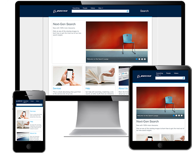
Search 3.1 was intended as the front-end for our new search engine, but it took so long for our infrastructure to be put in place that I ended up re-designing it before it could be implemented.
This was the first responsive design that I will claim ownership for (search 3.0 was a hodgepodge of experiments in responsive/adaptive layout). I designed the homepage (shown) to be like a marketing site for our service, with the idea of showcasing the improvements we were making to Search.
Search 2.0
View website (archived view)
- SHTML
- CSS
- jQuery
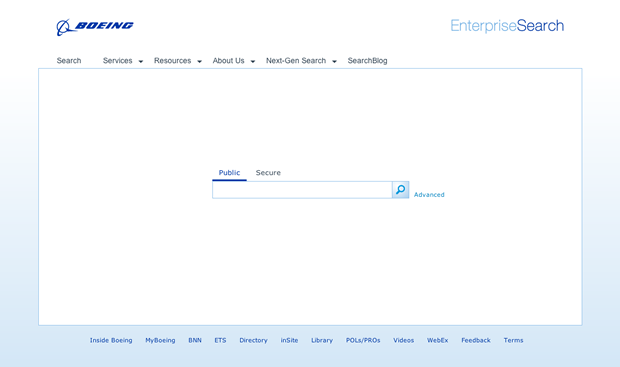
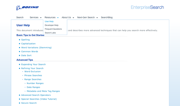
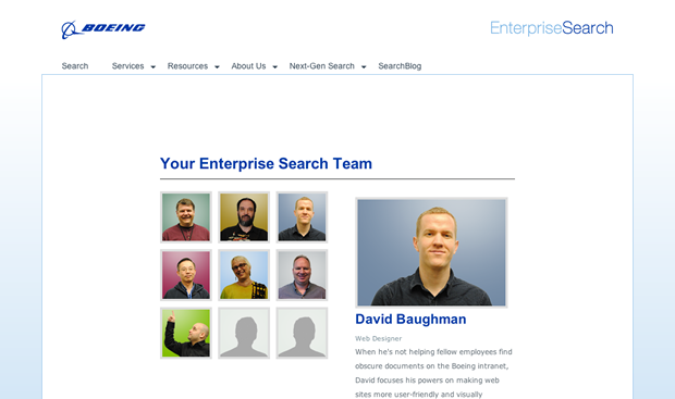
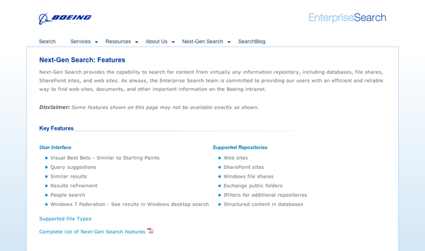
Search 2.0 was the first re-design I did for Enterprise Search a few months after joining the group. Prior to this, the search landing page our user/developer reference materials were completely separate, so it was difficult for users to get self-help on everyday topics.
The previous landing page was completely different from the rest of the site, so it was unclear that it was even the same site. This design is simple, and was aimed at creating a more unified web presence for Enterprise Search.
Want to hire me? Download my resumé for contact info.